
Olympic legacy is a touchy subject. And, when it comes to logo branding, everyone tends to have a say on it. An Olympic logo is for the future generations of the hosting city to cherish.
Mascots do play a significant role in keeping the memories alive. The current generation may not remember the much-panned 1980 Moscow Olympics, which the US boycotted to protest the then Soviet Union’s capture of Afghanistan. Moscow Olympics’ mascot became so famous that many parents named their children Misha, the name of the loveable bear, the mascot of Moscow Games.
It has not even been two months since this year’s Olympic Games in Tokyo were postponed to 2021 due to the ongoing coronavirus global pandemic, that a new controversy has erupted following design change of the Tokyo games logo. A name change can cause all sorts of confusion.
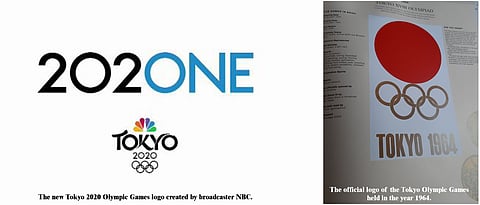
NBC, which contributes the major chunk of revenue to the International Olympic Committee, through broadcast rights, has made its own branding for the coverage of the sporting event.
This consists of ‘Tokyo 2020’ in a rather elegant script, with the Olympic rings below it and the NBC logo above it. But now, above all that, there’s a new addition: 202ONE.
‘202ONE’ is, well, quite tricky to unpick.
Whichever way one looks at it, whichever way we turn our heads, we’re still left baffled. Does it mean 2020 - NE? If so, what does NE stand for? Is it NBC’s smaller, younger relative that we don’t know about?
Does it signify 202 - ONE? In which case, what is 202? It reminds of a 404 error page, used when something has gone wrong.
Or maybe you read it as ‘20 - two - one’, which makes it sounds like a clock or an ominous countdown. Will this be the new race starter, instead of ‘three - two - one’?
Surely, we will concede, it is supposed to read: ‘2020 - ONE’, but then isn’t it missing a ‘0’? Or is this a ridiculously clever trick that we’re just not appreciating? Is this the new way to say both years in one?
And how do we pronounce it, exactly? Just 2021? 2020 and 1? 2020-all-in-1? It’s safe to say we have a lot of questions.
Tokyo hosted Asia’s first Olympics in 1964 when Japan showed it to the world its erudite resilience to recover from the American bombings during the Second World War. In just 20 years, Japan got ready for the global event. Seemingly 20 is somehow attached to Japan’s preparedness.
They got the 2020 Olympics, and another world war on coronavirus was to nudge their readiness. Now that Olympics dates are settled for 2021, it would be insane to stoke another controversy.
The original Tokyo 2020 Olympics branding was created by MOCEAN, in partnership with illustrators Aya Kotake, Burke Miles, Stanley Ng and Jamie Givens. We don’t have any confirmation as to who created this add-on. However, the typography, which does not exactly match the crafted curves of the ‘Tokyo’, suggests that perhaps this was not created by the same team.
Some people, however, are in favour of the 2020NE branding decision.
It is perfection for someone like me who loves minimalist design!
